Before I create a poster, I have to think about how I want it to look and how I plan to make it. Here's a step-by-step guide to my creation process.
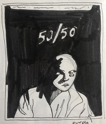
After this, I do another, more detailed sketch. Here, I focused on roughly mapping out the lighting and contrast between the figure and text with the black background, but I might add some colour here if the poster is more complex.
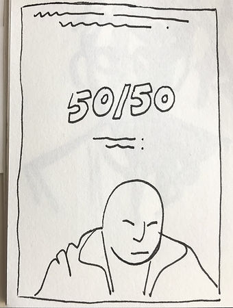
In my sketchbook, I do a rough sketch of how I want the composition to look, and the types (or in this case, type) of font I'm thinking of using. I try to keep this sketch as simple as possible, so I can build off it later.

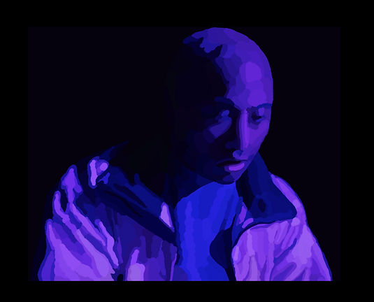
Deciding on a colour palette is one of the most difficult parts of the process, but arguably the most essential. In this poster, I wanted the image to be vibrant, but still feel moody, so I chose a variety of dark blues and purples.

I then create a more detailed digital sketch based off the ones in my sketchbook and map out the shadows.
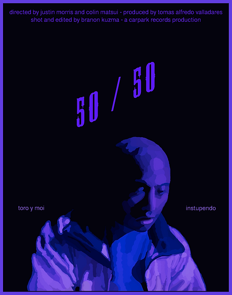
After playing around in Photoshop, I create the poster itself. As I already had an idea of what I wanted from the start, all I had to do was add text and a border. I think this poster turned out well - simple but effective.

Following this, I use the colours in the palette I created earlier as a base, and begin to paint in the smaller details.
Once I finish painting and I'm happy with the final image, I import it from Krita, the painting application I use, into Photoshop, to assemble the poster.
Here, I play around with fonts, to see what works well.


In addition to a poster, I often make an alternative design; the ideas of the poster arranged for promotion on social media. This eliminates any non-essential information so the image packs more of a punch, and of course its dimensions are 1x1, to be used on platforms such as Instagram and Twitter.